There’s something about the first cool evening of the season that makes me want to change everything at home.
The linen throw suddenly feels too summery. The bright flowers on the table don’t look quite right anymore. I start turning lamps on earlier, reaching for heavier blankets, and wanting the whole house to feel a little deeper and cozier.
And yet, I don’t necessarily want orange everywhere.
Orange pumpkins, orange leaves, orange cushions, orange wreaths—traditional fall decorating can start to feel very predictable very quickly.
The good news is that your home doesn’t need orange to feel like fall.
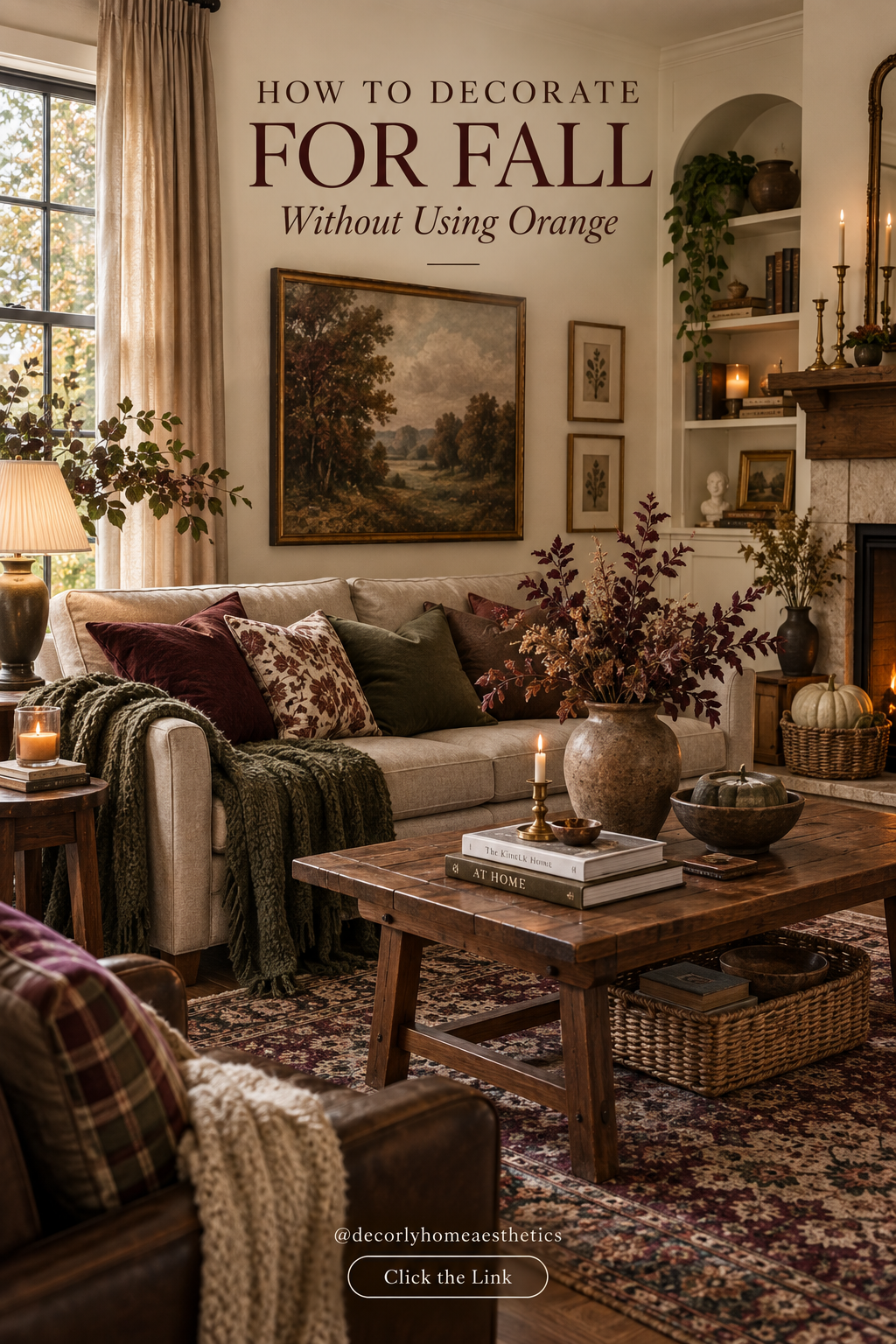
In fact, some of the most beautiful autumn interiors I’ve seen barely use it at all. Instead, they rely on chocolate brown, burgundy, olive green, plum, walnut, oatmeal, aged brass, and layers of wonderful texture.
Fall is really a feeling more than a specific color.
It’s warm lamplight at five in the afternoon. A wool blanket tossed over the sofa. Darker wood. Branches gathered from outside. A slightly faded rug. Candles burning on the coffee table.
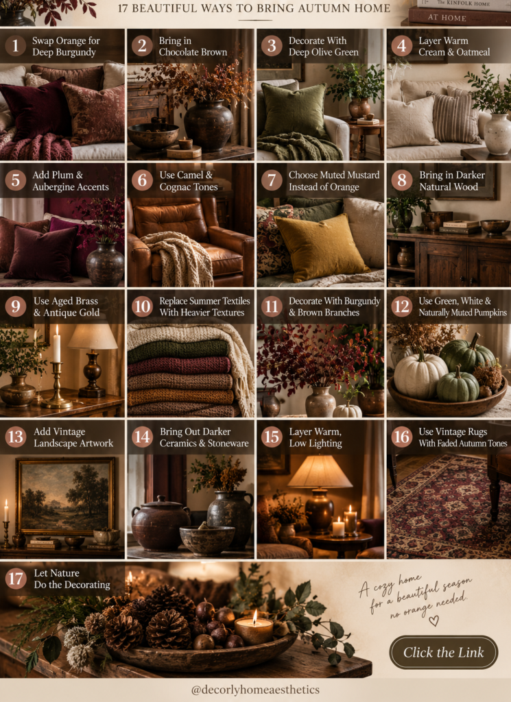
So if you love autumn but want your home to feel a little more sophisticated this year, here are 17 ways to decorate for fall without using orange.
1. Swap Orange for Deep Burgundy
If you remove orange from your fall palette, burgundy is probably the first color I’d bring in.
It has everything we want from an autumn color: warmth, depth, richness, and a slightly dramatic quality.
But it doesn’t immediately scream seasonal decor.
You don’t need much.
Try one burgundy velvet cushion on a cream sofa. Bring in a dark wine-colored throw. Place deep red branches in an old ceramic vase.
Burgundy also works beautifully through rugs and artwork because it can quietly appear in the background rather than dominating the room.
Pair it with cream, walnut, chocolate brown, olive, or aged brass and it immediately feels grown-up.
2. Bring in Chocolate Brown
Chocolate brown might be one of the easiest ways to make a home feel warmer for fall.
And unlike a lot of seasonal decor, you won’t necessarily want to remove it in November.
If your room is currently very light, introduce brown through smaller pieces first.
A chocolate linen cushion.
A dark wooden bowl.
Brown pottery.
A wool blanket.
A walnut side table.
Even a stack of old books with worn brown covers can help.
Chocolate brown looks particularly beautiful against oatmeal and cream because it gives those lighter neutrals some much-needed contrast.
Instead of a room that feels beige, you get something much richer and more grounded.
3. Decorate With Deep Olive Green
Green doesn’t have to disappear when summer ends.
It simply gets darker.
Fresh mint and bright leafy greens can give way to olive, moss, forest, and muted sage.
Olive is especially beautiful for fall because it works so naturally with wood and warm neutrals.
Try an olive wool throw over an oatmeal sofa.
Use olive cushions alongside chocolate brown.
Bring in a green ceramic lamp or vase.
You can even let actual plants provide part of the color.
The combination of olive + walnut + cream + burgundy is one of my favorites because it feels unmistakably autumnal without relying on any traditional fall decorating clichés.
4. Layer Warm Cream and Oatmeal
A no-orange fall home doesn’t need to become dark and moody from floor to ceiling.
Actually, darker autumn colors usually look better when there’s something light around them.
That’s where warm cream and oatmeal come in.
Use them for larger areas such as:
cream walls, oatmeal upholstery, linen curtains, neutral rugs, bedding, or large blankets.
Then layer your darker seasonal colors on top.
A burgundy cushion looks much richer against oatmeal than it does surrounded by ten other dark colors.
And a chocolate wooden table stands out beautifully against a creamy rug.
Think of warm neutrals as the quiet background that allows everything else to work.
5. Add Plum and Aubergine Accents
Purple might not immediately come to mind when you think about fall.
But forget bright purple.
Think plum, aubergine, blackberry, and dusty wine.
These deeper shades can look incredibly sophisticated in autumn interiors.
A plum velvet cushion beside chocolate brown feels luxurious.
An aubergine lampshade can transform a corner once the light is switched on.
Even a small arrangement of dark purple flowers or foliage can completely change a neutral table.
The trick is restraint.
Plum tends to look best when it appears once or twice rather than becoming the theme of the entire room.
6. Use Camel and Cognac Tones
Camel and cognac give you the warmth people often look for in orange, but in a much quieter way.
You may already have these colors in your home without realizing it.
Leather chairs.
Wooden furniture.
Woven baskets.
Old books.
Natural fiber rugs.
A camel-colored wool blanket.
Rather than buying seasonal decorations, look around for things you already own in these tones and bring more of them into your main living spaces.
Cognac leather beside olive green is particularly beautiful.
Add cream linen and walnut wood and you already have a complete fall palette.
7. Choose Muted Mustard Instead of Orange
If you miss having one brighter autumn color, muted mustard can fill that role beautifully.
But I’m talking about a very particular mustard.
Not sunshine yellow.
Look for something closer to ochre, antique gold, or faded mustard.
Use it sparingly.
One small cushion.
A stripe running through a vintage rug.
A ceramic bowl.
A little detail in a painting.
Muted mustard gives the room warmth without taking you back into the traditional orange-and-yellow fall palette.
It also looks fantastic beside burgundy, chocolate brown, olive, and plum.
8. Bring in Darker Natural Wood
Sometimes you don’t need to add a new fall color at all.
You just need more wood.
Walnut, mahogany, medium oak, and darker vintage woods naturally make rooms feel warmer.
If your home currently contains mostly pale furniture, try introducing one darker piece.
It could be a thrifted side table, vintage stool, picture frame, wooden bowl, or small cabinet.
Don’t worry about matching every wood tone.
A room often looks more interesting when several natural wood finishes have been collected over time.
The slight variation is what keeps everything from feeling like a furniture showroom.
9. Use Aged Brass and Antique Gold
Metal finishes can change with the seasons too.
Bright chrome and polished silver can feel crisp and cool.
For fall, I love something softer.
Aged brass, antique gold, and darker bronze work beautifully with the deeper colors we’re using.
Think:
old candlesticks, brass picture frames, vintage lamps, small trays, cabinet hardware, or a simple bowl.
You don’t need much.
Actually, too much shiny gold can quickly make a room feel less sophisticated.
A few slightly aged pieces are usually enough to catch the evening light and add warmth.
10. Replace Summer Textiles With Heavier Textures
One of the easiest seasonal changes has nothing to do with color.
Change the texture.
That lightweight cotton throw you’ve been using all summer can be replaced with wool.
Smooth cushions can give way to velvet, brushed linen, boucle, or heavier woven fabrics.
Add a chunky knit blanket to a reading chair.
Bring a thicker quilt onto the bed.
Texture is what makes you want to curl up in a room.
And that’s really what fall decorating is about.
You could keep your entire home cream and brown and still make it feel dramatically more autumnal simply by changing the fabrics.
11. Decorate With Burgundy and Brown Branches
Instead of buying artificial orange leaves, look outside.
Real seasonal branches have irregular shapes, uneven leaves, and subtle colors that are difficult to imitate.
Look for branches in deep red, burgundy, brown, muted green, or bare natural wood, using only plants you’re permitted to cut.
Put them in a large stoneware or glass vessel and don’t fuss with them too much.
Let one branch lean awkwardly.
Let another stretch higher than the rest.
Natural arrangements usually look better when they aren’t perfectly symmetrical.
And when the branches eventually dry or drop their leaves, bare branches can be beautiful too.
12. Use Green, White and Naturally Muted Pumpkins
You don’t have to ban pumpkins just because you’re avoiding orange.
Real pumpkins and winter squash come in wonderful muted colors.
Look for varieties in:
creamy white, dusty sage, muted green, pale taupe, or gray-green.
Use only a few.
Maybe place two naturally shaped pumpkins beside the fireplace.
Put one small cream pumpkin on a stack of books.
Arrange a few on an outdoor table.
The goal isn’t to create a pumpkin display.
It’s to let them become another natural object in the room.
And real, imperfect shapes almost always look more beautiful than rows of identical decorative pumpkins.
13. Add Vintage Landscape Artwork
Artwork is an underrated way to change the seasonal mood of a room.
You don’t necessarily have to switch your artwork every season, but if you enjoy doing it, autumn is a wonderful time to bring out darker landscapes.
Look for paintings or prints showing:
woodland scenes, quiet countryside, misty mountains, old cottages, cloudy skies, darker florals, or muted botanical subjects.
Vintage landscapes naturally contain many of the colors we’re already using—brown, olive, cream, burgundy, charcoal, and faded blue.
And because it’s actual artwork rather than “fall decor,” it can stay up long after the season ends.
14. Bring Out Darker Ceramics and Stoneware
Summer makes me want clear glass and light ceramics.
Fall makes me reach for stoneware.
Dark brown pottery, speckled cream ceramics, olive vessels, charcoal bowls, and deep burgundy pieces all add weight to a room.
They don’t have to be expensive.
In fact, slightly imperfect pottery often looks more interesting.
Check your kitchen cupboards before buying anything.
That old brown serving bowl you’ve barely used might look wonderful on the coffee table filled with pinecones or left completely empty.
A cream pitcher could become a vase for branches.
Decorating often becomes more interesting when ordinary objects are used somewhere unexpected.
15. Layer Warm, Low Lighting
You can use the perfect autumn color palette and still have a room feel wrong under one bright ceiling light.
Fall interiors need atmosphere.
As the evenings become darker, start using smaller light sources around the room.
A table lamp on the console.
A floor lamp beside the sofa.
A reading lamp near an armchair.
Candles on the dining table.
Wall sconces if you already have them.
The idea is to create several small pools of warm light rather than flooding the entire room from above.
It makes wood look richer, textiles feel softer, and deeper colors like burgundy and olive become incredibly beautiful.
Just keep the light itself warm rather than strongly orange-tinted—you want cozy illumination, not an orange filter over the whole room.
16. Use Vintage Rugs With Faded Autumn Tones
A rug can quietly establish the entire fall palette.
Instead of choosing something filled with bright orange, look for faded designs containing:
burgundy, chocolate brown, muted olive, plum, taupe, cream, or dusty blue.
Vintage and vintage-style rugs work particularly well because their colors tend to feel softened rather than bright and new.
If you’re buying a rug, pay attention to size as much as color.
A beautiful rug that’s too small can make a living room feel disconnected.
Ideally, the rug should be large enough to visually connect your main furniture pieces.
And if you already own a rug somewhere else in the house, try moving it before buying another one.
Sometimes a bedroom rug is exactly what your living room needs for fall.
17. Let Nature Do the Decorating
Some of the best fall decor isn’t really decor at all.
Branches.
Pinecones.
Acorns.
Seed heads.
Dried grasses.
Interesting pieces of wood.
Seasonal greenery.
A bowl of pears or dark red apples.
These things bring the season indoors without turning your home into a themed display.
You don’t need all of them.
Gather a few things that make sense where you live and use them sparingly.
A bowl of pinecones on a wooden table might be enough.
A tall vase of branches might be the only seasonal element in your living room.
Fall decorating becomes much more beautiful when you stop trying to prove that it’s fall.
A Fall Color Palette Without Orange
If you want an easy starting point, use:
Chocolate Brown + Burgundy + Deep Olive + Warm Cream + Plum + Walnut + Aged Brass
You don’t need to use every color equally.
I would let cream and oatmeal form the background.
Use walnut and chocolate brown to ground the room.
Then introduce burgundy, olive, and plum in smaller amounts.
Finally, let aged brass appear through lighting, frames, and a couple of decorative objects.
For a lighter home, try:
Oatmeal + Mushroom Taupe + Muted Olive + Dusty Burgundy + Natural Oak
This gives you the same autumn atmosphere without making the room particularly dark.
How to Make a Room Feel Like Fall Without Adding Fall Decor
This is where things get interesting.
Imagine your living room in summer.
You have a cream sofa, wooden coffee table, neutral curtains, and a light rug.
You don’t necessarily need to replace any of those things.
Instead, remove the lighter summer accessories.
Bring out a chocolate wool throw.
Add one burgundy cushion.
Put an olive cushion beside it.
Replace fresh summer flowers with tall branches.
Move an old brass candleholder onto the coffee table.
Bring a woven basket beside the sofa.
Turn on the table lamp as the afternoon light fades.
That’s it.
Nothing actually says fall.
But the room feels completely different.
Don’t Forget About Scent
A seasonal home isn’t only about what you see.
Scent can create the feeling of autumn before you’ve changed a single cushion.
Instead of relying on extremely sweet pumpkin fragrances, try scents such as:
cedar, sandalwood, fig, apple, clove, cardamom, vanilla, amber, pine, or smoky woods.
Even something as simple as simmering apple slices with cinnamon and spices can make the house feel cozy.
Just be careful with fragrance if anyone in your household is sensitive to scented candles or essential oils.
A home should smell pleasant to the people living there—not simply fit the season.
What to Do With Your Existing Orange Fall Decor
You don’t necessarily need to throw anything away.
If you already own orange decorations you love, store them for another year or use them in a different way.
A terracotta pot, for example, might work beautifully because its earthy color feels natural rather than overtly seasonal.
A faded rust-colored textile might also fit perfectly with burgundy and brown.
The point isn’t that orange is bad.
It’s simply that orange doesn’t have to be the default.
Once you remove that assumption, fall decorating becomes much more interesting.
Keep the House Lived-In
One thing I would avoid is making the room so carefully styled that nobody wants to touch anything.
Leave the blanket slightly rumpled.
Keep the books you’re actually reading on the side table.
Put your favorite mug on a tray.
Let the branches be imperfect.
Have a basket that genuinely holds something useful.
The most inviting fall homes aren’t perfect.
They look like someone might sit down, turn on the lamp, pull the blanket over their legs, and stay there for the evening.
That’s the atmosphere we’re trying to create.
Final Thoughts
You don’t need orange pumpkins, orange leaves, or orange cushions to make your home feel like autumn.
Start with chocolate brown, burgundy, deep olive, plum, walnut, oatmeal, and warm cream.
Then think beyond color.
Bring in wool, velvet, linen, darker wood, vintage rugs, stoneware, old books, aged brass, natural branches, and softer lighting.
Use a few muted pumpkins if you love them—or don’t use pumpkins at all.
The best fall decorating doesn’t necessarily announce the season the moment someone walks through the door.
It simply makes the house feel warmer, deeper, softer, and more inviting than it did a month ago.
And sometimes that’s all you need.