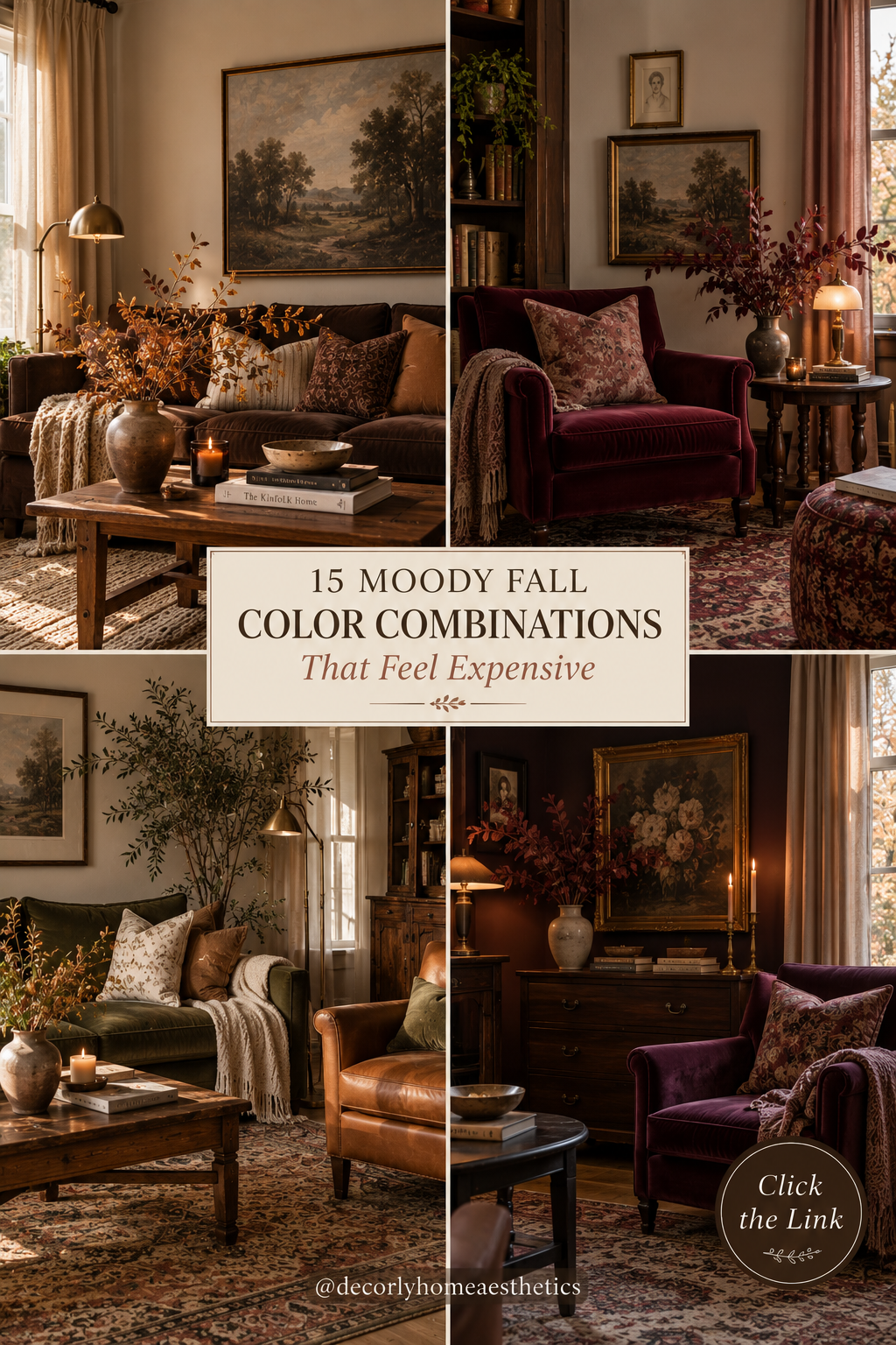
There’s a point every fall when I suddenly want my home to feel deeper, warmer, and a little more dramatic.
But that doesn’t necessarily mean bringing out orange pumpkins, leaf garlands, and decorations that immediately announce fall.
Sometimes the most beautiful seasonal change is simply color.
Chocolate brown instead of pale beige. Burgundy instead of bright red. Deep olive instead of fresh spring green. Plum, walnut, camel, rust, espresso, and antique brass layered against warm creams and soft natural fabrics.
These colors create that cozy autumn feeling without making your home look overly seasonal. And, perhaps even better, many of them have a richness that can make an ordinary room feel surprisingly expensive.
You don’t need to repaint your entire house, either. A velvet cushion, wool throw, vintage rug, darker lampshade, vase of branches, or even a few secondhand books can introduce enough color to shift the mood.
If you’re ready to move beyond traditional orange-and-brown fall decorating, here are 15 moody fall color combinations that feel sophisticated, cozy, and beautifully collected.
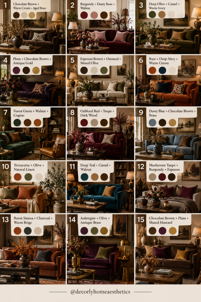
1. Chocolate Brown + Warm Cream + Aged Brass
If I had to choose just one expensive-looking fall palette, this might be it.
Chocolate brown has the depth we naturally crave during autumn, while warm cream prevents it from becoming heavy.
Then aged brass adds just enough warmth.
Imagine a chocolate-brown sofa against creamy walls with oatmeal curtains, a walnut coffee table, and an old brass floor lamp.
You don’t need all of those things, though.
If your living room is currently light and neutral, try adding chocolate through cushions, a wool blanket, pottery, or a dark wooden side table.
Then introduce a little aged brass through a lamp, candlestick, tray, or picture frame.
The important word here is aged.
Soft, slightly imperfect brass generally feels more collected than lots of shiny yellow-gold accessories.
Try: chocolate cushions + cream sofa + vintage brass lamp.
2. Burgundy + Dusty Rose + Walnut
Burgundy is having one of those moments where it suddenly feels fresh again.
It’s deep enough for fall but more sophisticated than bright seasonal red.
Pair it with dusty rose and something interesting happens: the burgundy becomes softer while the pink becomes moodier.
Walnut grounds everything.
You could bring this combination into a bedroom with burgundy bedding, dusty-rose cushions, and a walnut nightstand.
Or try it in the living room through a faded rug containing both colors.
You don’t need much burgundy.
A single velvet armchair, lampshade, throw, or piece of artwork can establish the palette.
The result feels romantic without becoming overly sweet.
3. Deep Olive + Camel + Warm Ivory
This is fall decorating for people who don’t really want fall decorations.
Deep olive gives you that connection to nature while camel adds warmth and ivory keeps everything airy.
It works especially well with natural materials.
Think olive upholstery, camel leather, warm ivory linen, dark wood, woven baskets, pottery, and aged metal.
If you already have an ivory or cream living room, this palette is incredibly easy to introduce.
Add an olive throw and a couple of camel-colored cushions.
Bring in some branches.
That’s often enough.
And unlike overtly seasonal colors, this combination can comfortably stay in your home all year.
4. Plum + Chocolate Brown + Antique Gold
Plum deserves far more attention in fall interiors.
It has the drama of burgundy but feels slightly less expected.
Combined with chocolate brown, it becomes wonderfully moody. Antique gold introduces a warm glimmer that keeps all those dark colors from feeling flat.
I’d use this combination in a room where you want atmosphere—a dining room, reading corner, bedroom, or cozy sitting room.
Try plum cushions against a brown sofa or a plum lampshade beside dark wooden furniture.
At night, warm lamps make this palette especially beautiful.
You don’t need much gold.
One old frame or small lamp is enough.
5. Espresso Brown + Oatmeal + Muted Olive
If you love quiet, neutral interiors but want them to feel richer for autumn, try this.
Espresso is almost black but noticeably warmer.
Oatmeal softens it.
Muted olive gives the palette a subtle natural element.
The contrast is what makes it work.
A room filled entirely with pale oatmeal can start feeling washed out. Introduce espresso through a coffee table, picture frames, cabinet, or wooden chair, and suddenly the lighter colors look intentional.
Then use olive sparingly.
Perhaps a cushion, vintage pottery, artwork, or greenery.
This is one of my favorite palettes for creating an expensive-looking neutral room without making everything beige.
6. Rust + Deep Navy + Warm Cream
Orange is associated with fall for good reason, but you don’t have to use bright pumpkin orange.
Rust is the grown-up alternative.
It’s earthy, faded, and much easier to live with.
Pairing it with deep navy makes it even more sophisticated.
Then warm cream stops both colors from dominating.
Try a navy armchair with a rust-colored cushion against cream walls. Or place a rust throw over cream bedding and introduce navy through artwork.
Dark wood and aged brass also work beautifully with this combination.
It still feels unmistakably autumnal—just without needing a single decorative pumpkin.
7. Forest Green + Walnut + Cognac
If you want your home to feel like an old library on a rainy October afternoon, this is your palette.
Forest green brings the mood.
Walnut brings depth.
Cognac leather adds warmth.
It’s particularly beautiful in living rooms, offices, libraries, and reading corners.
You could have a green armchair beside a walnut bookcase with a cognac leather stool.
But smaller changes work too.
Try forest-green cushions, brown leather accessories, vintage books, and a darker wooden side table.
Add warm lamp light and suddenly the room feels incredibly cozy.
This palette loves things that have some age: worn leather, old books, vintage rugs, antique brass, and imperfect wood.
8. Oxblood Red + Taupe + Dark Wood
Oxblood is deeper and browner than classic red, which is exactly why it works so beautifully in sophisticated interiors.
It feels dramatic without screaming for attention.
Taupe gives it somewhere quiet to sit, while dark wood makes everything feel grounded.
If oxblood feels intimidating, don’t start with a wall.
Start tiny.
An oxblood cushion on a taupe sofa can be enough.
Or try a dark red ceramic vase, vintage rug, throw, or lampshade.
Repeat the color once elsewhere in the room and stop.
That’s often more elegant than trying to make every accessory match.
9. Dusty Blue + Chocolate Brown + Brass
Blue isn’t the first color most people think of for fall, which is precisely why I like this combination.
Dusty blue has enough gray in it to feel muted rather than summery.
Chocolate brown warms it immediately.
Brass adds another layer of warmth.
Imagine faded blue curtains beside a brown velvet chair, with a small brass lamp glowing nearby.
Or use dusty blue through artwork while keeping your larger furniture brown and cream.
It’s a wonderful option if you want seasonal warmth but don’t particularly love traditional autumn colors.
10. Terracotta + Olive + Natural Linen
Terracotta and olive naturally belong together.
Both feel earthy and slightly sun-faded, while linen keeps the combination relaxed.
This palette can lean Mediterranean, rustic, organic modern, or European country depending on how you style it.
Try terracotta pottery on a wooden console, olive cushions on a linen sofa, and a large arrangement of garden branches.
The trick is avoiding overly bright terracotta.
Look for shades that feel dusty, baked, and slightly brown.
Then choose muted olive rather than vivid green.
The softer the colors, the more timeless the combination becomes.
11. Deep Teal + Camel + Walnut
Deep teal is a fantastic choice when you want a moody interior without relying on green or burgundy.
It has enough blue to feel interesting but enough green to work beautifully with autumnal browns.
Camel brings warmth, while walnut adds richness.
This could be as simple as a teal armchair beside a walnut table with a camel-colored wool blanket.
Or use teal through curtains, artwork, cushions, or painted cabinetry.
I particularly like this palette in rooms with warm evening lighting.
The teal becomes deeper as the daylight disappears, while camel and walnut seem to glow.
12. Mushroom Taupe + Burgundy + Espresso
Mushroom taupe is one of those colors that doesn’t sound particularly exciting until you see it used well.
It’s warmer and earthier than gray but less yellow than traditional beige.
That makes it a beautiful background for stronger colors.
Add burgundy for depth and espresso for contrast.
You could start with mushroom walls or upholstery, then add one burgundy textile and a few espresso wood or metal details.
The finished room feels quiet but definitely not boring.
This is also an easy palette to introduce if your house is already mostly neutral.
You don’t have to replace everything—you simply need to deepen what you already have.
13. Burnt Sienna + Charcoal + Warm Beige
For something slightly more contemporary, try burnt sienna with charcoal.
Burnt sienna gives you autumn warmth without looking like obvious seasonal orange.
Charcoal adds sophistication.
Warm beige softens the contrast.
A burnt-sienna chair can look beautiful against a charcoal feature wall, but you can create the same effect on a much smaller scale.
Try charcoal picture frames, a beige sofa, and sienna-colored cushions.
Natural wood works beautifully here too.
Just avoid making the charcoal overwhelmingly dominant, particularly in a room with limited natural light.
14. Aubergine + Olive + Antique Brass
This might be the moodiest combination on the list.
Aubergine is a deep purple with enough brown or red underneath to feel incredibly rich.
Pair it with olive and you get a palette that feels almost botanical.
Then antique brass brings in warmth.
I’d use aubergine selectively.
A velvet chair.
A throw.
A lampshade.
A few cushions.
Maybe even a small painted cabinet if you’re feeling adventurous.
Then let olive appear through upholstery, textiles, ceramics, or natural greenery.
Against cream or warm taupe walls, these colors can look stunning without making the room excessively dark.
15. Chocolate Brown + Plum + Muted Mustard
This combination has a slightly retro personality, and I love it for that.
Chocolate creates the foundation.
Plum adds richness.
Muted mustard provides a small spark of warmth.
The important part is keeping the mustard subdued.
Think antique gold, ochre, or faded mustard rather than bright yellow.
You might have a chocolate sofa with plum cushions and one small mustard throw.
Or use all three colors inside a vintage-style rug and keep the rest of the room fairly neutral.
It’s warm, interesting, and just unexpected enough to make people look twice.
How to Use Moody Colors Without Making Your Home Feel Dark
There’s an important difference between a moody room and a dark room.
You can use deep colors without painting every wall burgundy.
The easiest approach is to keep your largest background fairly light and introduce darker colors through layers.
For example, start with:
warm cream walls + oatmeal sofa + natural rug
Then introduce:
chocolate wood + burgundy cushions + aged brass lighting
You get all the richness without losing the light.
If your room receives limited daylight, use your deepest colors on smaller pieces rather than large walls.
And pay attention to lighting.
Moody colors usually look their best with several warm light sources rather than one bright overhead fixture.
Use Texture Alongside Color
Color alone isn’t what makes these combinations feel expensive.
Texture matters just as much.
Chocolate brown looks richer in velvet, wool, leather, dark wood, or heavy linen than it does across ten matching plastic accessories.
Try mixing:
linen + velvet + wool + wood + aged metal + handmade pottery
You don’t need every texture in every room.
The point is simply to avoid making everything too smooth and perfect.
A slightly worn walnut table beside a soft linen sofa and an old brass lamp already creates plenty of contrast.
Let Wood Become Part of the Palette
One of the easiest ways to make fall colors feel natural is to treat your wood furniture as a color.
Walnut is brown.
Oak can be honey, camel, or oatmeal.
Dark-stained wood can behave almost like espresso or charcoal.
Instead of ignoring those existing colors and adding five new ones, build around them.
If you already own a walnut dining table, for example, try pairing it with burgundy and warm cream.
If your home has lighter oak floors, olive, camel, terracotta, and linen can work beautifully.
Sometimes the best fall palette is already halfway there.
You Don’t Need Traditional Fall Decorations
This is probably my favorite thing about decorating with seasonal color.
Your home can feel like autumn without looking like you’ve decorated it specifically for autumn.
Instead of putting pumpkins on every surface, try:
a plum throw, deeper cushion covers, a vintage wooden bowl, burgundy branches, dark pottery, a warmer lampshade, or an old landscape painting.
The feeling comes from the atmosphere.
You can still use pumpkins if you genuinely love them, of course. A couple of naturally imperfect pumpkins can look beautiful.
They just don’t have to do all the work.
Don’t Make Everything Match
If you choose burgundy, don’t suddenly buy a burgundy rug, burgundy cushions, burgundy curtains, burgundy candles, and burgundy artwork.
That’s when a sophisticated palette starts feeling themed.
Instead, let the colors move around the room.
Maybe burgundy appears in one cushion and subtly inside the rug.
Walnut comes from the coffee table.
Cream comes from the curtains.
Brass appears on the lamp.
Olive comes from a chair.
The colors relate to each other without becoming a matching set.
That slightly collected quality is what often makes interiors feel expensive.
The Easiest Fall Color Update If You’re on a Budget
If you don’t want to buy much, focus on textiles and things you can move.
Start with your existing neutral room.
Then change two or three small elements.
Swap a pale cushion for chocolate brown.
Move a darker throw onto the sofa.
Bring an old wooden stool into the room.
Cut a few autumn branches for a vase.
Bring out your brass candleholders.
Stack a couple of old books on the coffee table.
Turn on the lamps instead of the ceiling light.
You may discover that you don’t need any actual “fall decor” at all.
Which Combination Should You Choose?
If you love quiet luxury, try:
Espresso + Oatmeal + Muted Olive
If you want something classic and expensive-looking, choose:
Chocolate Brown + Warm Cream + Aged Brass
For something romantic, try:
Burgundy + Dusty Rose + Walnut
If you prefer earthy interiors, go with:
Deep Olive + Camel + Warm Ivory
For a dark, dramatic room, choose:
Plum + Chocolate Brown + Antique Gold
If you want something unexpected, try:
Dusty Blue + Chocolate Brown + Brass
And if you’re drawn to a more collected, slightly vintage look, I’d choose:
Forest Green + Walnut + Cognac
Final Thoughts
Fall decorating doesn’t have to mean filling your house with seasonal objects.
Sometimes changing the color story is enough.
Chocolate brown can make a cream living room feel warmer. Burgundy can turn an ordinary bedroom into something intimate and cozy. Olive works beautifully with the wood furniture you already own. Plum adds drama. Camel softens dark colors. And a little aged brass can bring warmth without making a room feel flashy.
The combinations that tend to look most expensive aren’t necessarily the boldest.
They’re the ones that feel layered rather than matched.
Start with one deep color, balance it with something softer, and use wood or aged metal to ground everything.
Then bring in texture—linen, wool, velvet, pottery, old books, worn wood, and imperfect branches.
You don’t need to transform your entire home for fall.
A few deeper colors, softer lights, and warmer textures can be enough to make the rooms you already love feel completely different for the season.