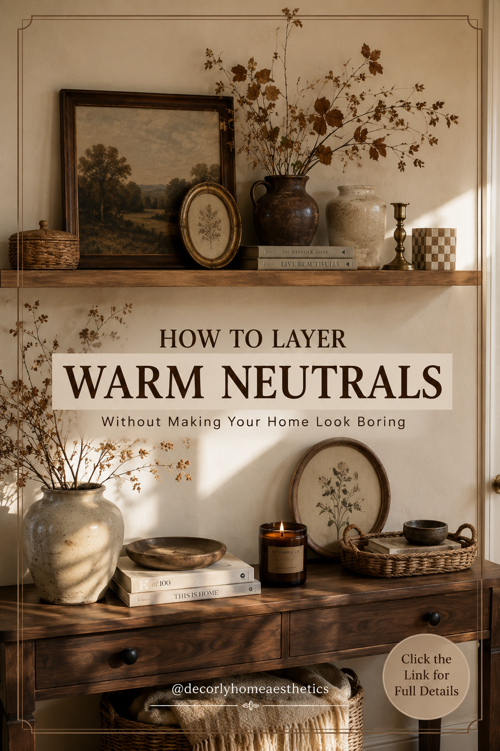
There’s a reason warm neutral homes keep showing up on my saved boards.
Cream walls, worn wood, linen curtains, old pottery, woven baskets, soft brown accents—there’s something incredibly calming about that combination. It feels comfortable without trying too hard.
But there’s also a problem with neutral decorating.
Take away too much color, pattern, and contrast, and suddenly a room that was supposed to feel peaceful just feels… beige.
I’ve seen plenty of neutral rooms where the sofa blends into the rug, the rug blends into the walls, and everything seems to be the exact same shade of oatmeal. Nothing is technically wrong with the room, but there’s nowhere for your eye to land.
The secret isn’t adding lots of color back in. It’s layering neutrals properly.
A warm neutral room needs different tones, textures, materials, shapes, and a little contrast. Once those things are there, you can decorate almost entirely with cream, beige, brown, and natural wood and still have a room that feels full of character.
Here’s how I’d do it.
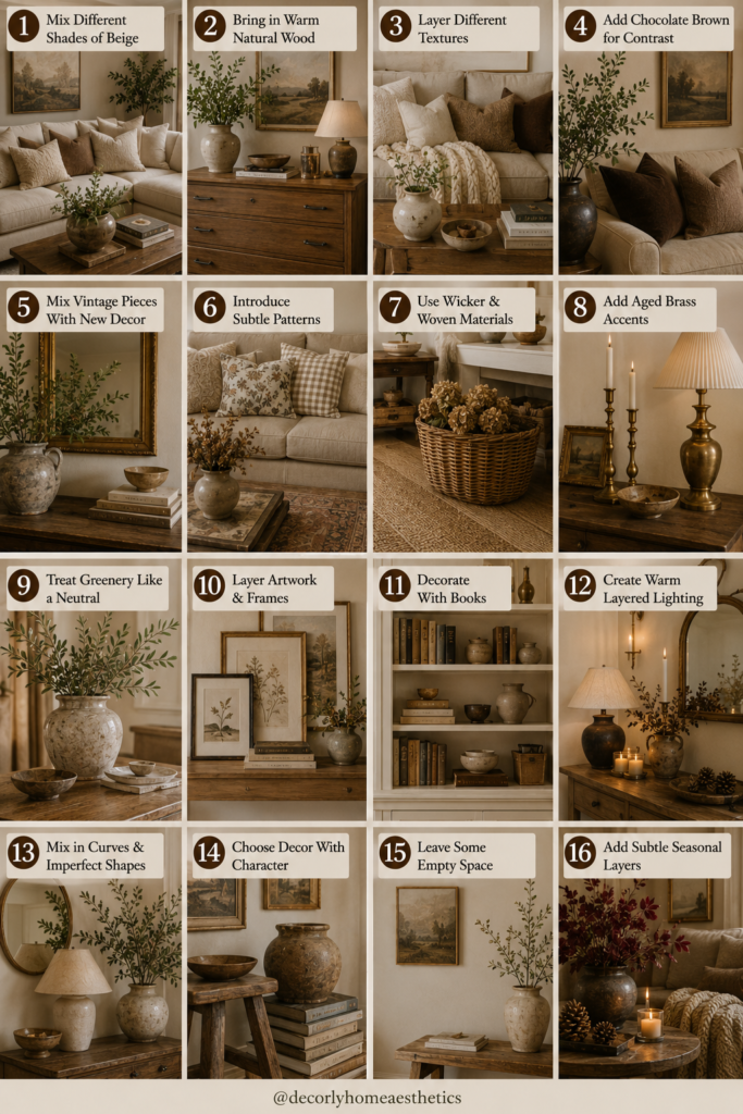
1. Stop Trying to Match Every Shade of Beige
This is probably the easiest mistake to make.
You find a beige sofa you love, so you start looking for the exact same beige for the rug, curtains, cushions, and walls.
But matching everything is exactly what makes a neutral room feel flat.
Instead, think of your palette as a family of colors.
You might have warm ivory walls, an oatmeal sofa, mushroom-colored cushions, a camel chair, and a chocolate brown side table.
None of them match perfectly, but they belong together.
That variation creates depth.
If you’re starting from scratch, choose three or four neutral shades rather than one. Something like cream + oatmeal + camel + chocolate brown is a great foundation.
2. Let Warm Wood Do Some of the Work
Natural wood is one of the best things you can add to a neutral room.
It introduces warmth without introducing a completely new color.
A chunky oak coffee table can completely change a cream living room. So can walnut shelves, an old pine dresser, a wooden stool, or even a few large cutting boards leaning against a kitchen backsplash.
And again, don’t worry too much about matching wood tones.
A home filled with identical wood can sometimes feel more like a furniture showroom than somewhere that’s evolved naturally.
It’s completely fine to have a medium oak table beside a darker antique frame.
The slight differences make things interesting.
3. Texture Matters More When You’re Using Less Color
If you’re decorating with strong colors, the colors themselves create interest.
In a neutral room, texture has to do more of that work.
Imagine a sofa with five cushions that are all the same smooth cream fabric.
Now imagine the same sofa with a linen cushion, a chunky wool cushion, one soft velvet pillow, and a slightly nubby woven throw.
Same basic color palette.
Completely different feeling.
Look for materials such as linen, wool, cotton, bouclé, jute, rattan, aged leather, raw wood, stone, and handmade ceramics.
You don’t need all of them in one room.
Even three or four noticeably different textures can stop neutrals from feeling one-dimensional.
4. Add Chocolate Brown for Contrast
If your neutral room feels washed out, it may simply need something darker.
Chocolate brown is perfect for this.
It gives the eye somewhere to rest while still keeping the palette warm.
Try a dark wooden side table, brown velvet cushion, vintage frame, ceramic vase, leather chair, or even a small lampshade.
You don’t need much.
A few darker objects repeated around the room can provide enough contrast to make all the lighter colors suddenly look better.
Black can do this too, but brown feels softer if you’re going for a particularly cozy interior.
5. Mix Old Things With New Things
One of my favorite ways to make a neutral home more interesting has nothing to do with color.
Add something old.
It might be a thrifted landscape painting, an old wooden stool, a slightly tarnished brass candlestick, vintage pottery, an antique-style mirror, or a basket that has clearly been used for years.
A room filled entirely with new furniture and new accessories can sometimes feel too polished.
Older pieces break that perfection.
They bring little scratches, faded colors, worn edges, and irregular finishes that are difficult to recreate with something brand new.
And neutral rooms are the perfect background for them.
6. Don’t Forget Pattern
Neutral doesn’t mean pattern-free.
You can use quite a lot of pattern while keeping a room calm if the colors remain subtle.
Try a faded Persian-style rug in brown and cream.
Add a small gingham cushion.
Use a thin stripe on an armchair.
Hang softly patterned curtains.
Bring in a botanical print.
The pattern doesn’t have to be dramatic.
In fact, patterns that look slightly faded or vintage often work beautifully in warm neutral rooms because they add movement without becoming the focus of the space.
7. Bring In Woven Materials
Wicker and woven textures instantly make neutral rooms feel more relaxed.
And they’re useful.
A large woven basket can hold blankets.
Smaller baskets can hide everyday clutter.
A rattan tray can organize a coffee table.
A woven pendant can soften a dining room.
A jute rug can introduce texture beneath more polished furniture.
I wouldn’t fill an entire room with rattan—unless that’s specifically the look you’re after—but a few woven details help break up smooth painted and upholstered surfaces.
8. Use Brass Instead of Making Everything Matte
When almost everything in a room is soft, matte, and neutral, a little shine can make a surprising difference.
That’s where metal comes in.
Aged or antique brass is especially beautiful with warm neutrals.
Try it through a picture frame, small lamp, cabinet hardware, candlestick, mirror, or decorative bowl.
You don’t need enough brass for anyone to consciously notice that you’ve used brass.
It’s simply there to catch the light and provide contrast against softer materials like linen, wood, and wool.
9. Use Greenery as a Neutral
Technically, green isn’t neutral.
But in a warm, earthy room, I often treat it like one.
A few leafy branches in a ceramic vase can bring life to a room without changing its overall palette.
Olive branches, eucalyptus-style foliage, herbs, and simple seasonal clippings all work beautifully.
Just don’t feel like every empty corner needs a plant.
One large branch arrangement often looks more intentional than ten tiny plants scattered around the room.
And if you’re decorating seasonally, this is an easy thing to change.
Green branches in summer can become dried leaves or bare branches in fall and winter.
10. Layer Your Artwork Instead of Hanging Everything
Not every piece of artwork needs to be perfectly centered on a wall.
In fact, warm neutral homes often feel more relaxed when some art is leaned rather than hung.
Try leaning a small framed botanical print against the wall on an open shelf.
Place a smaller vintage frame in front of a larger piece.
Add a little ceramic vase or candle beside them.
That creates layers and makes shelves feel collected over time.
The same approach works on mantels, kitchen counters, and console tables.
Just leave some empty space between groupings. Layered doesn’t have to mean crowded.
11. Use Books to Break Up Neutral Decor
Books are one of the easiest things to forget when styling a room, yet they add so much character.
Stack two or three beneath a small bowl.
Lean several beside a vase on an open shelf.
Leave one open on the coffee table.
You don’t need to buy books based on the color of their covers.
Actually, I’d avoid that.
Use books you genuinely like. Their slightly varied colors, lettering, and worn edges will make the room feel more personal.
A neutral room benefits from those little bits of imperfection.
12. Make the Lighting Warm
You can get every material and paint color right and still make a warm neutral room feel cold with the wrong lighting.
Pay attention to your lamps.
Instead of relying entirely on one ceiling fixture, spread several smaller sources of light around the room.
A table lamp beside the sofa, a wall sconce, and perhaps another lamp on a console can make the room feel much softer in the evening.
Lampshades matter too.
Linen, pleated fabric, and warm cream shades work beautifully with this style.
And avoid extremely cool, harsh bulbs if you’re trying to create a cozy atmosphere.
Warm neutrals look their best in warm light.
13. Give Your Neutral Room a Few Imperfect Shapes
Another reason neutral rooms can look boring is that everything is sometimes too straight.
Rectangular sofa.
Rectangular rug.
Rectangular coffee table.
Rectangular artwork.
Rectangular cushions.
Try breaking some of those lines.
Add a round side table.
Use an irregular handmade ceramic vase.
Hang an oval mirror.
Choose a curved lamp.
Bring in branches that naturally twist in different directions.
These shapes add movement without adding more color.
14. Don’t Buy Neutral Decor Just Because It’s Neutral
This is something I think we could all remind ourselves of occasionally.
If you’re standing in a store holding a beige vase you don’t particularly love simply because it matches your house, put it back.
Neutral decorating becomes boring very quickly when the goal is just to fill every surface with objects in the correct color.
I’d rather have one beautiful old ceramic pot on a shelf than five generic beige accessories.
Choose things because you like their shape, texture, craftsmanship, or story.
The fact that they work with your color palette should come second.
15. Let Some Empty Space Stay Empty
Layering does not mean covering every surface.
Actually, empty space is what makes layers noticeable.
If you style an open shelf, leave part of it bare.
If your coffee table has a beautiful tray and vase, you probably don’t need something decorating every remaining corner.
If one wall has a gallery arrangement, perhaps the wall beside it can stay simple.
A room needs quieter moments.
Otherwise, all those lovely textures and vintage pieces start competing with one another.
16. Add Seasonal Warmth Without Changing the Whole Room
One of the nicest things about warm neutrals is how easily they move through the seasons.
You don’t need to completely redecorate for fall.
Keep the cream sofa, natural wood, linen curtains, baskets, and neutral rug.
Then introduce a few deeper elements.
Swap one cream cushion for chocolate brown or burgundy.
Replace fresh summer greenery with dried branches.
Bring out a heavier knitted throw.
Add a few pinecones or seasonal branches to a wooden bowl.
Maybe switch a light ceramic vase for something darker and more rustic.
Suddenly the room feels like fall, but nothing looks overly themed.
A Warm Neutral Palette That Doesn’t Feel Flat
If I were building a warm neutral room from scratch, I’d probably use:
Warm ivory + oatmeal + camel + walnut + chocolate brown + aged brass + muted olive
The ivory would form the lightest background.
Oatmeal would come through larger textiles such as upholstery and rugs.
Camel and walnut would introduce warmth.
Chocolate brown would provide contrast.
Brass would catch the light.
And muted green would bring just enough life into the room.
You could easily take the same palette into a kitchen, bedroom, bathroom, or entryway.
The Biggest Mistake With Warm Neutral Interiors
For me, it’s trying too hard to make everything look perfect.
Perfectly matching baskets.
Matching vases.
Matching wood.
Matching cushions.
Three identical decorative books underneath a carefully positioned ceramic bowl.
That isn’t necessarily what makes a room feel expensive or beautifully designed.
The homes I find myself saving usually feel slightly less planned.
There might be a modern sofa beside an old wooden table.
A thrifted painting hangs over a newer console.
One cushion has a faded stripe while another is plain linen.
There’s a basket that doesn’t quite match the others.
That’s what gives a room personality.
Final Thoughts
A warm neutral home doesn’t need more beige.
It needs layers.
Different shades.
Rough textures beside smooth ones.
Old wood beside soft linen.
Something dark against something pale.
A little brass catching the afternoon light.
Books that have actually been read.
Artwork you chose because you genuinely liked it.
A basket that’s useful as well as beautiful.
And maybe a slightly crooked branch sitting in an old ceramic pot.
Those are the things that keep neutral interiors from feeling flat.
So if your cream-and-beige room feels like something is missing, don’t immediately add a bold new color.
Try adding texture, contrast, age, pattern, and personality first.
You might find that the neutral palette was never the problem at all.