Lilac probably isn’t the first color that comes to mind when you think about fall decorating.
Most of us immediately picture rusty orange, brown leaves, deep reds, pumpkins, and maybe a little mustard yellow. Lilac feels like it belongs somewhere around April, next to fresh flowers and crisp white linen.
But I’ve been loving the idea of taking colors we normally associate with one season and using them completely differently.
And lilac can be really beautiful in fall.
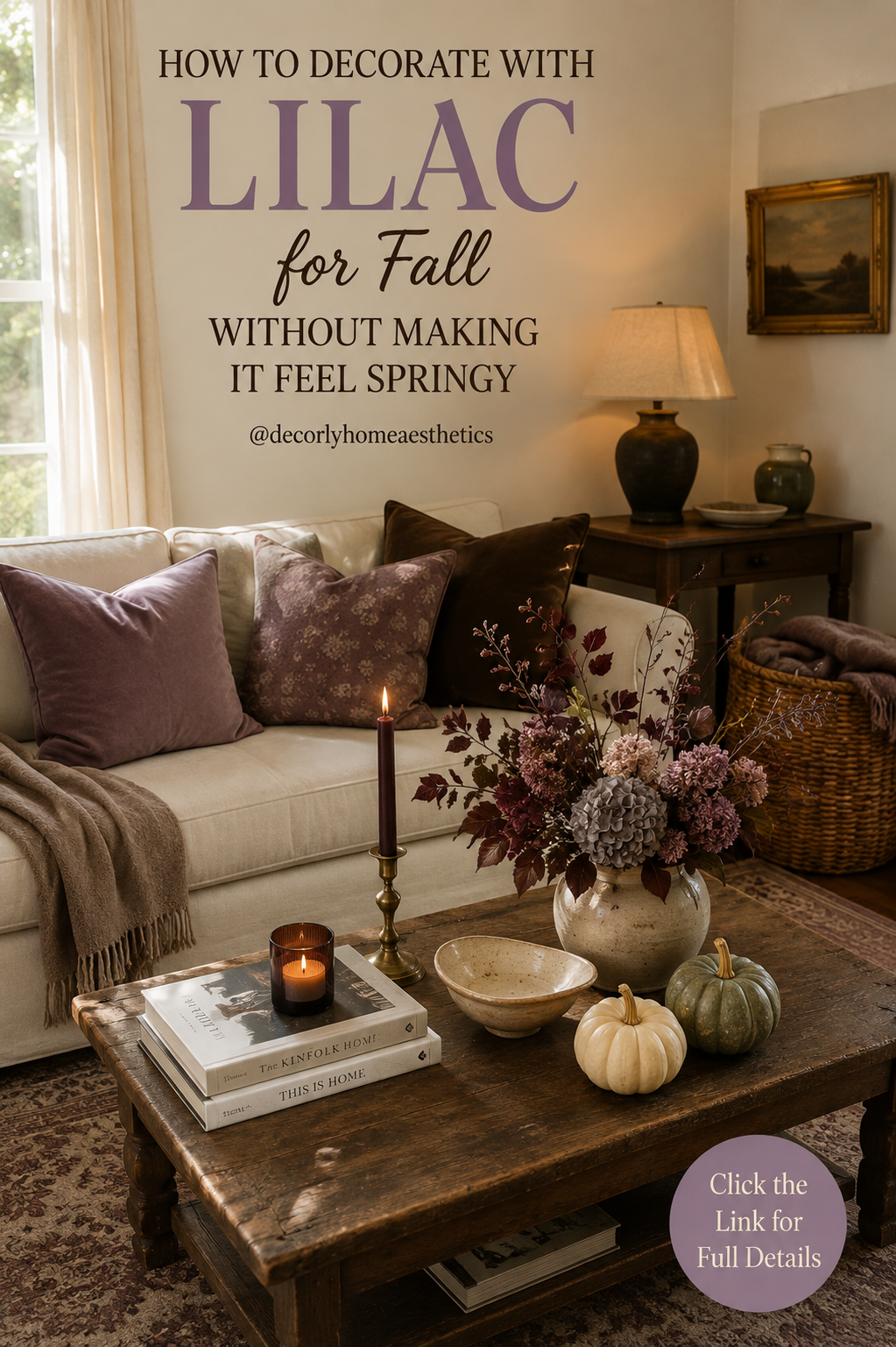
The trick is choosing the right lilac and, more importantly, paying attention to what you put around it. A pale purple cushion surrounded by white furniture and pastel flowers will naturally feel springy. Put that same color next to dark walnut, chocolate brown, burgundy, aged brass, and warm candlelight, and suddenly it has an entirely different personality.
If you want to try something beyond the usual orange-and-rust fall palette this year, here’s how I’d bring lilac into a home without making it look like spring arrived six months early.
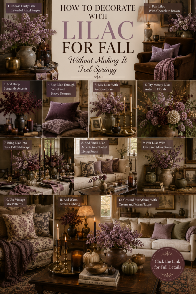
1. Skip the Pastel Lilac
This is probably the most important part.
For fall, I wouldn’t use a sugary lavender or a very bright purple. Instead, look for lilac that has a little gray or brown mixed into it.
Think dusty lilac, faded mauve, smoky lavender, and muted plum.
These slightly muddier shades have much more depth. They also work naturally with the earthy colors we already use during autumn.
An easy place to start is with one dusty-lilac cushion on a cream sofa. You don’t need a matching throw, rug, curtains, and vase.
One little unexpected touch is often much prettier.
2. Put Lilac Next to Chocolate Brown
If there’s one combination that immediately takes lilac away from spring, it’s chocolate brown.
A lilac velvet cushion looks completely different on a dark brown chair than it does on a white one.
The same applies to furniture.
Dark walnut coffee tables, vintage wooden cabinets, brown leather, chocolate velvet, and darker woven baskets all help ground purple tones.
If your home already has plenty of natural wood, you may actually find lilac surprisingly easy to introduce.
I especially love dusty lilac against walnut. There’s something about the coolness of the purple and the warmth of the wood that makes both colors look richer.
3. Add Burgundy for Depth
Burgundy is another color that works beautifully with lilac.
And unlike purple, burgundy already feels unmistakably autumnal.
Try placing a faded lilac cushion beside a burgundy one, or mix dusty mauve flowers with dark red foliage in a vase.
You could even bring burgundy in through something as small as a taper candle.
The colors don’t need to match exactly. In fact, it’s better when they don’t.
That slightly imperfect mixture of mauve, wine, plum, and brown feels much more natural than decorating with one precise shade repeated around the room.
4. Choose Fall Textures
Sometimes it’s not the color that makes something feel seasonal. It’s the material.
Lilac linen can feel light and summery.
Lilac velvet feels completely different.
For fall, bring the color in through heavier, softer textures—velvet cushions, wool throws, brushed fabrics, vintage rugs, and thick woven textiles.
Even a faded floral cushion with a little mauve running through the pattern can work.
This is also a good reason not to rush out and buy a lot of specifically “fall” decorations. A change in texture can make your room feel warmer without adding a single pumpkin.
5. Let Antique Brass Warm Everything Up
I love antique brass in autumn anyway, but it’s especially useful when decorating with lilac.
Brass adds warmth beside cooler purple tones and makes the whole combination feel a little older and more collected.
You don’t need much.
A pair of mismatched brass candlesticks on the mantel, an old picture frame, a small bowl on the coffee table, or a vintage-style lamp can be enough.
I’d choose aged or brushed finishes rather than very shiny gold.
A little tarnish and variation actually works beautifully here. It keeps the room from feeling too polished.
6. Rethink Your Fall Flowers
This is where lilac can look especially good.
Instead of the usual bright orange autumn bouquet, try something moodier.
Dried hydrangeas are perfect because they naturally fade into those strange, beautiful shades of mauve, dusty purple, brown, green, and burgundy.
Mix them with a few dark leaves and bare branches.
Don’t make the arrangement too perfect.
Let one branch lean farther than the others. Leave some stems exposed. Use flowers at slightly different stages of drying.
A loose arrangement in an old ceramic vase will look much more convincing than a perfectly rounded bouquet.
And because the colors are faded rather than fresh and pastel, it still feels like fall.
7. Try Lilac on the Dining Table
If you’re nervous about putting lilac throughout your living room, the dining table is a nice place to experiment.
Start with cream or natural linen.
Then add muted-lilac napkins alongside dark wood, smoky glassware, simple ceramics, and brass candlesticks.
Use burgundy or chocolate-brown taper candles instead of white ones.
For the centerpiece, keep things loose and seasonal—perhaps dried hydrangeas, branches, or a handful of small cream pumpkins.
You only need that little touch of lilac in the napkins to make the table feel different.
It’s unexpected without looking strange.
8. Keep Lilac as an Accent
One mistake I would avoid is trying to make lilac the main color of the room.
For this look, it works much better as the surprise.
Imagine a room that’s mostly cream, walnut, taupe, and brown. Then your eye catches one dusty-purple cushion and a few mauve flowers on the coffee table.
That’s enough.
You might add a second tiny reference somewhere else—perhaps a faded lilac detail in a vintage rug or piece of artwork.
Repeating the color once or twice makes it feel intentional.
Repeating it everywhere starts turning the room purple.
9. Mix It With Olive Green
Lilac and green naturally work together, which is probably part of the reason the combination can feel so spring-like.
The solution is simply to change the green.
Instead of fresh mint or bright leafy green, choose olive, moss, sage, or deep forest tones.
A muted olive cushion beside dusty lilac is gorgeous for fall.
So is an old green ceramic vase filled with mauve hydrangeas.
These earthy greens make lilac feel much more grounded and give you another way to connect the color to the outdoors without creating a spring-garden palette.
10. Look for Faded Vintage Patterns
Not every lilac accent has to be a solid block of purple.
Sometimes the prettiest way to use it is almost accidentally.
Look at vintage-style rugs, old floral cushions, botanical artwork, and patterned textiles. You may find faded mauve and lavender tucked among brown, cream, olive, and burgundy.
That’s exactly the kind of lilac I’d use.
It feels as though it has always been part of the room rather than something added because a particular color is trending.
A faded floral cushion on an old wooden chair can sometimes do more for a room than an entire collection of new seasonal accessories.
11. Change the Lighting
Lighting has a huge effect on how lilac reads in a room.
Bright, cool daylight can emphasize its fresh purple side.
Warm evening light brings out the gray, mauve, and brown underneath.
As fall approaches, I naturally start using table lamps earlier in the evening anyway.
Try warm lampshades, amber glass, and a few candles rather than relying entirely on bright overhead lighting.
Against that warmer glow, dusty lilac becomes softer and moodier.
It’s one of those small changes that you don’t necessarily notice immediately, but the whole room suddenly feels cozier.
12. Ground Everything With Cream and Taupe
With all the talk about lilac, burgundy, olive, chocolate, and brass, it’s easy to forget that the majority of the room should probably stay quiet.
Cream and warm taupe give all these deeper colors somewhere to breathe.
Keep your sofa neutral.
Let the walls stay simple.
Use a cream ceramic vase or a natural linen curtain.
Then layer the stronger colors on top.
I like thinking of it as roughly mostly warm neutrals, plenty of brown and wood, and just little moments of lilac, burgundy, and olive.
You get the unusual color combination without losing that calm, comfortable feeling we want from a fall home.
You Don’t Need to Get Rid of Pumpkins
Using lilac doesn’t mean pretending it’s not autumn.
Bring in a few pumpkins if you love them.
I’d just keep them natural and fairly understated.
A small cream pumpkin and a dusty green one sitting beside a vase of mauve hydrangeas can look beautiful. Even a muted orange heirloom pumpkin could work because the deeper purple creates such an interesting contrast.
What I’d avoid is surrounding the lilac with lots of bright orange plastic decorations.
Let the seasonal details feel like things you might genuinely bring home from the market or garden.
Start With What You Already Own
Before buying anything purple, have a look around your home.
Maybe there’s already a mauve thread running through your rug.
Perhaps you have an old floral cushion tucked away in a cupboard or a ceramic vase with a slightly lavender-gray glaze.
Bring those pieces together first.
Then, if the room still needs something, add one new element.
It could be as simple as a velvet cushion or a bunch of dried hydrangeas.
Fall decorating doesn’t need to mean replacing half the room every September.
The most interesting homes usually look as though they’ve changed slowly rather than being redecorated overnight.
The Combination I’d Try First
If you’re starting from scratch, keep it really simple.
Take a cream sofa and add one dusty-lilac cushion and one chocolate-brown cushion.
Put a taupe throw over the arm.
On a walnut coffee table, add a cream ceramic vase filled with faded mauve hydrangeas and burgundy branches.
Bring in one amber candle and an old brass candlestick.
Then add one or two small natural pumpkins.
And stop there.
Live with it for a day before adding anything else.
You might be surprised by how autumnal lilac can actually feel when everything around it is warm, dark, and slightly moody.
Final Thoughts
Fall doesn’t have to be orange every year.
That’s probably what I like most about decorating with lilac. It’s unexpected, but it doesn’t have to feel trendy or forced.
The secret is simply to dirty the color up a little.
Choose dusty lilac instead of pastel lavender. Put it beside walnut and chocolate brown. Add burgundy, olive, aged brass, dried flowers, and warm lighting.
And don’t use too much of it.
When lilac is just one small part of a warm, layered room, it stops feeling like spring and starts feeling surprisingly perfect for those first cool days of fall.
Sometimes one unusual color is all it takes to make a familiar season feel new again.